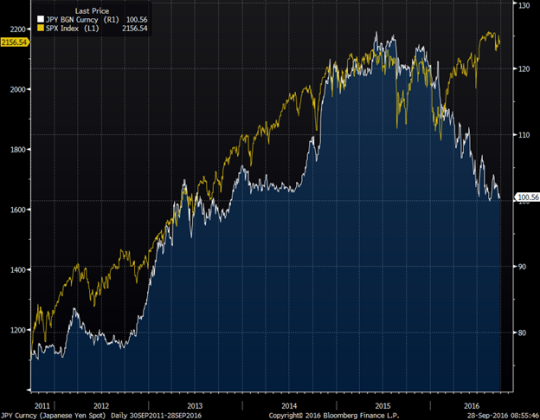
When can traders out-economize the economists?
In both my public comments and investor correspondence, I have been consistently emphasizing the importance of separating expert opinions from layperson’s hunches. Applying this advice to myself, I try to rely on my strategic edge rather on my economic forecasts.
In fact, taking this point even further, I don’t rely on anyone’s economic forecasts. But it is not because I consider the analysts who produced those views incompetent. Indeed, there are those with intellectual frameworks I highly respect. Still, for every well thought-out argument, there is an opposite one equally well-substantiated.
Current US economy and stock market bulls and bears are a great example; both camps have excellent charts, statistics, and qualitative opinions. When two experts I respect disagree so strongly, I have no choice but to believe the future is uncertain. And forecasts from either side have little value other than establishing a paradigm.
So are there times when traders can see something economists do not? The jury is still out on this one. I’m convinced more often than not that market professionals delude themselves by thinking their hunches regarding a particular unemployment number or inflation statistic have predictive power.
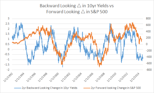
But I believe there is one area in which traders may have an edge: we tend to have a strong sense of momentum. While the analysts measure where things are, traders think in terms of where things are going. Thus, when a business cycle turns, traders may have a stronger strategic commitment to a nascent economic trend.
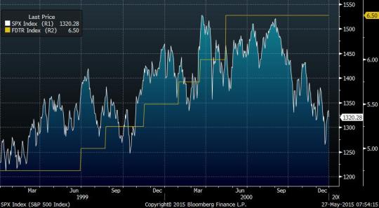
I will not use the cycle turning of 2007-2008 as an example – it was too unusual. But I remember well 2000-2001. The NASDAQ index started to collapse throughout 2000, while the Fed raised rates 100bp in the first half of the year and kept them flat at 6.5% for the remainder of the year. Only towards the end of the year in 2000 did the Fed begin to initiate mild talk of a potential economic slowdown.
NASDAQ vs FED Funds Target Rate, 2000 – 2003
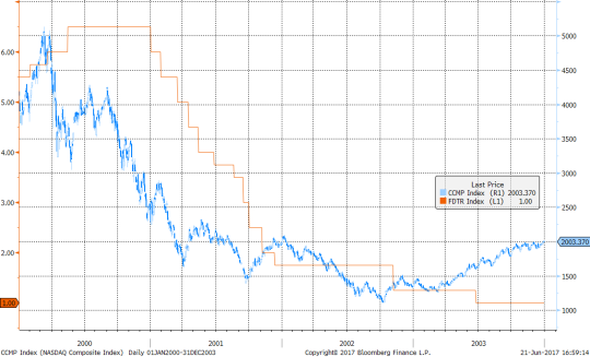
To be sure, the central bank accepted recession being a real risk early in 2001 and started cutting rates aggressively. But not aggressively enough even though we in the trenches were quite sure that the dot.com bust was leading to the inevitable recession and a much deeper fall in interest rates. For the younger market participants, I will remind that the recession was not caused by September 11th. It was a virtual certainty months before. I even suspect that the terrorist attack, in fact, accelerated the recovery by forcing the Fed to ease even faster and by bringing stimulus into the economy.
I remember that sense of confidence: “blah blah blah, whatever the research says,” the rates are going down! Of course, for every time one could have been right this way and made a fortune, there could be several false starts; traders reading too much into a transitory data shift. I cannot prove or disprove the value of this momentum sense. I am just bringing it to your attention and judgment.
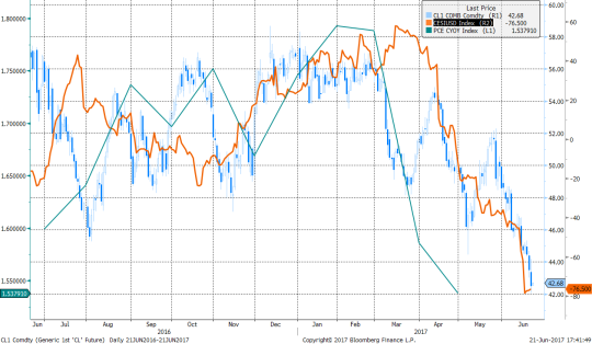
Why am I writing about this today? Over the last few weeks, my momentum sense started to tingle. The recent fall in oil prices and core inflation together with other incrementally soft data are beginning to signal the roll-over of the cycle and the bond markets are running with it. Meanwhile, the analysts are still vigorously debating.
Crude, US Surprise Index, Core PCE (y/y), June 2016 to present
To re-emphasize: my bullish bond position is not contingent on this current perception but on my strategic framework which is independent of forecasts. The cycle does not have to end today, I can wait to make money tomorrow.
But I can’t help having a hunch – value or no value.
Good luck,