Flat Curves and Recessions

All too often I hear sentences like “The bond market and the stock market say opposite things about the economy” or “A flat curve means recession, so if you expect the curve to get flatter that means you are expecting an imminent recession”.

The purposes of this post are to dig a little deeper into the concepts of concurrencies and causality associated with the yield curve and to challenge some of the common assumptions embedded in the statements above.

While the “Freakonomics” crowd loves debunking confusion between correlation and causality, I will instead write in terms of the distinction between “causes” and “indicators” and, furthermore, between “leading” and “concurrent” indicators.

My strategy mostly deals with causes. In my book, I discuss how causal relationships between two market events can be characterized in terms of necessity and concurrency and how to trade based on such characterization.

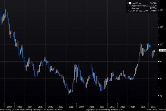
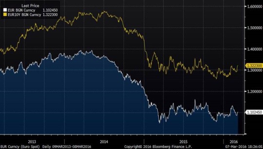
By way of example, the Fed moving to tighter monetary policy has a clear causality relationship with a stronger dollar and a flatter US yield curve. As always, some would disagree even with this paradigm. But I am comfortable with this causality being if not as “certainty”, but an at least a “certain likelihood”. 

In my book, I have demonstrated how, in 2014, the stronger dollar was a concurrent necessity with respect to rising rates and thus a dominant trade. That meant by the time the Fed tightened, dollar would have to have strengthened but it might have (and did!) strengthened even without the tightening.

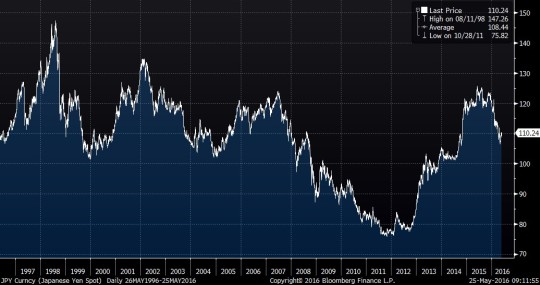
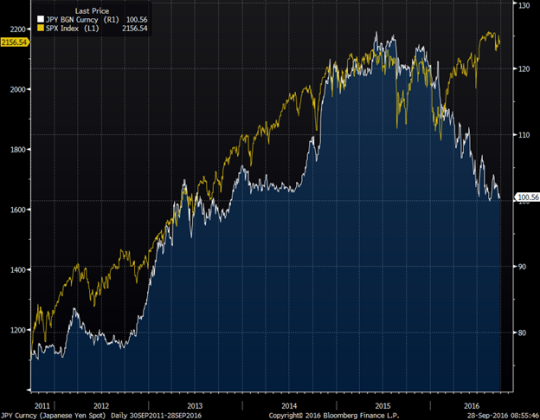
There are, however, highly correlated pairs of market events with a more obscure causality relationship. For example, up until 2016, USDJPY traded in high correlation with all risk assets, including not only the Nikkei but also the S&P 500. In my post, The Tale of Three Shorts, I have discussed some of the complexity there and even suggested that strong JPY trade may be a self-defeating chicken (a thesis yet to be verified). To put in simply, the correlation was obvious to me, but the causality wasn’t.

In such situations, I refer to events as “indicators” rather than “causes”. I have several times heard sentences like “weaker USDJPY spells trouble for stocks”. Such statements irked me as logically flawed, but the fallacy is not immediately obvious. Indeed, stocks tend to go down when JPY strengthens, don’t they?

This is where I introduce the notion of the concurrent indicator. If I look at my screen and see USDJPY up on the day and don’t look at anything else – what is my guess about the stock market? Of course, it’s more likely that the stocks are up. But why shouldn’t I look at anything else? I have a full screen of prices available.

My point is that USDJPY doesn’t convey any information about equities that I can’t see by looking at the equity screens. Yes, usually when USDJPY falls, S&P 500 trades lower as well, but if it did not go down there is no obvious ECONOMIC causality saying that it has to catch up. So, as I see it there is little predictive power to gain from divergence in this pair; what has happened, already happened. And with this mindset I was not at all shocked with the divergence of this year.

5Yr Chart of USDJPY (White) vs SPX (Yellow)

image

But what about the clearly statistically confirmed “leading” indicators? My contention here is that even those may not convey as much useful information as appears.

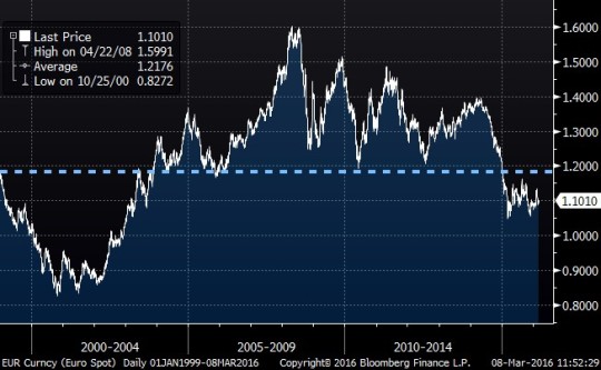
As you can guess, I am taking a swipe at the maxim that flat yield curves forecast recessions and steep yield curves forecast robust economic growth, which appears to be accepted by market participants almost without question.

The evidence is undoubtedly strong – flat curves indeed preceded all the recent recessions. But my question is, “does the curve convey any information about the possibility of a recession, we don’t have otherwise?”

Imagine that you have jumped from the roof of a high-rise. Falling past the 10th floor is a very reliable indicator of soon hitting the ground, but what new information does it contain?  Given that you jumped off consciously and are familiar with the law of gravity – none.

What if you fell while sleeping? Well, waking up to see the 10th-floor flash by is definitely good info. But returning the analogy to macro-trading, my assumption is that you are not asleep.

Then what if the law of gravity changes? In this case, the 10th floor may not even be a reliable leading indicator anymore.

Over the last few decades, we got used to certain patterns of the business/rates cycle. Events were happening in a certain order and over certain predictable time intervals:

1.       Rapid economic growth

2.       Tight labor market and inflationary pressure

3.       Rising rates

4.       Yield curve flattening

5.       Hiking cycle

6.       Bear stock market

7.       Rates fall

8.       Growth slows down

9.       Easing cycle

10.   Curve steepens

11.   Stock market rebounds

12.   Rapid economic growth

Notice, any of the events in this loop could be used as reliable leading indicators for any subsequent events. Assuming the loop persists.

As I have discussed in Chapter 4 of my book, historical patterns are important to study because they are more likely to repeat than not. But if we make an a priori assumption that this loop will just keep going on without alteration – we almost wouldn’t need to observe anything else – we would already know what happens next.

In that chapter, I gave an example of using interest rate momentum as a predictor of future stock market price action. That is, I showed a decent fit between the two-year backward looking change in the 10-year note yield and the two-year forward-looking change in S&P 500. In the loop above it would mean bullet point 7 (rates fall) is a leading indicator of 11 (stock market rebounds).

Backward-Looking Change in 10yr Yields vs Forward-Looking Change in S&P500 

image

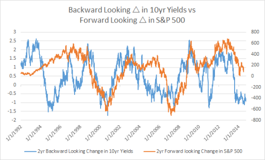
Why is there good information in this pattern? My claim is that the information is there because there is CAUSALITY. Lower funding rates lead to improved corporate profits. And this simple paradigm lends extra strength to my pattern argument.

When, however, people make the assumption that 4 (yield curve flattening) predicts 8 (economic slowdown), their assumptions are not backed up by direct causality. This does not imply the indicator is wrong, but rather it makes it more fragile.

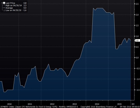
In the past decades, 4 (yield curve flattening) was typically associated with 5 (hiking cycle). However, as we have approached zero rates and entered the world of QE, the laws of gravity have changed. Curves in the developed world are flattening in the LOW rate environment and they are no longer backed by the causality of the increased funding cost.

The jury is out on whether in the new environment yield curves will reliably forecast the business cycle. My contention is that they are unlikely to carry any information not already familiar to an alert macro player.  For myself, I will stick to indicators resting on the simple and evident logic of causality.

Journey of Cash

A fascinating debate about equity valuations and the validity of lofty bond prices rages on. Some macro thinkers such as @MarkYusko, while not exactly calling top of the stock market, recommend building a substantial cash position. Their strategy is to wait in order to take advantage of an eventual, inevitable bursting of the equity bubble.

I do not intend to contribute an opinion to whether equities are currently a bubble or not; in fact, I have no opinion to contribute. But assuming some reasonable concern over valuations, cash appears aligned with my own recommendations in Chapter 5 of my book. In that chapter I propose sitting out the bubbles rather than trying to aggressively time them. This strategy avoids the risk of blowing up either on the short or on the long side.

However, it is important to understand that line of reasoning is predicated on the assumption that “cash” is actually SAFE.

For an individual cash has two separate, though interwoven aspects: cash is a means to pay for one’s lifestyle and it is a financial asset.

Those financially less secure will require the safety of cash to meet their immediate needs such as rent or food. If they are fortunate to have some savings they may be concerned that cash may fail to keep up with inflationary pressure, but if they live paycheck to paycheck they must count on the wage inflation.

For the purposes of this post, however, I am using the term ‘cash’ from the perspective of a money manager whose central objective is absolute performance. For such a manager, cash is purely a financial asset.

Managers tend to think of cash as “safe”. They lean on the thinking that when benchmarked to cash, cash will never deliver a negative return which is important both psychologically and in terms of calculating incentive fees. But such benchmarking is somewhat arbitrary: for example if you are benchmarked to gold your safest asset is gold and when you are benchmarked to S&P 500 your safest asset is…And so on.

The very concept of a “risky” asset comes from benchmarking.

While the concept of over/underperformance vs. a benchmark is relative to the choice of benchmark, the absolute performance is unambiguous. And by absolute I mean absolute – weighted by the performance of your base currency. That is a Euro-based asset manager who delivered a 10% return in 2014 still underperformed USD cash on that year. Notice that as incentive fees are calculated in base currency, most money manager wouldn’t currency-weigh their performance.

But if you are a truly global money manager you can think of cash as unsafe in three different ways:

  1. You have base currency risk
  2. You have benchmark risk, i.e. if you are supposed to track a stock index and you stay in cash – well you know what bad things may happen…
  3. You may underperform competitors in terms of returns in base currency

In summary, as a global manager, I view cash as an asset as risky as all others. My goal is absolute performance. While long-only managers can only make a decision to hold or not to hold cash, I have the option to be short or long cash like any other asset.

Indeed, using leverage to go long another financial asset is equivalent to going short cash, while going short an asset is equivalent to going leveraged long cash.

Having established our view of cash as a highly speculative investment, let’s look at how it is has performed.

USD cash was a good place to be invested early in 2008. The dollar index bottomed out in March 2008 and surged over the next year to make a cyclical top in March 2009 – the same month the stock market made its bottom. Over that year, dollar cash beat all stock markets, most commodities, most other currencies, most risky bonds. It only underperformed Treasuries – as one might have expected.

image

A bubble had formed. Yes the greatest bubble of this millennium (so far) was not Internet-2000, Sunprime-2006 or Bitcoin-2014.

It was Cash-2009.

Panicked, trading chickens who had piled into this cash bubble were brutally punished as recovering asset prices left them behind. How do I know that? Well, somebody had to be my counterparty.

Much of my success in subsequent years was due to recognizing this bubble and following my advice to sit it out. No, I didn’t go short cash. I just rotated my money out of it into the “safe haven” of stocks.

After an initial rebound, I got an additional tailwind as the Fed started to pound on cash by the wave of supply provided by multiple QEs.

Between 2010 and 2014 I gradually realized that the other CB’s will have to follow suit and destroy the value of their own cash. Now it was time to short foreign cash. The One Trade was born.

My version of it was not to be just long Treasuries, but to build leverage funding them in low (and now negative) yielding DM currencies.

The continuing success of that trade has been nothing short of magical.

But, now the question is whether the trade has gone too far and the cash has actually become too cheap?  The question more ambiguous as to whether I mean dollar or RoW cash. Much of the recent underperformance of USD-based mangers can be explained by the fact that they are benchmarked to strongly performing asset: USD.

Thus far my answer was to be slightly less net short cash, i.e. book some profits but still run the core position. Why am I being so stubborn, despite the lofty asset valuations?

When I think of cash as an asset (or even as a commodity?) there is practically no limit to how cheap you can get it by producing more and more of it. And that is what the BoJs and the ECBs of the world have been doing without any sign of stopping so far.

So is their no risk to being long bonds vs. cash? Theoretically there is. Going back to the duality of cash we have discussed earlier, cash can cheapen in two different ways:

  • Against real goods and services
  • Against financial assets

So far we are only seeing the latter in DM. The former is called inflation and when it arrives some financial assets may do even worse than cash. Paradoxically, in the event of an inflation scare, cash is historically the place to be as the DM CBs tend to protect it by raising rates and keeping its total return positive. Negative real interest rates are typically a product of a deflationary environment.

My central thesis is that secular automatization and globalization still channel excess cash into the asset rather than goods prices. But cyclical inflationary forces are not to be disregarded out of hand.

The case for cash is not proven, but it needs to be heard.

The Tale of Three Shorts: Part I

Short JPY, CNH, and NZD are three currencies positions that have been prone to elicit doubt and second guessing recently.The great JPY short (long USDJPY) initiated as early as 2010 is much discussed in my book. Through 2015 it satisfied many characteristics of a superior trade. 

Short CNH (long USDCNH) and NZD were also added to the portfolio in early 2015. Several of my blog posts discuss the favorable risk-reward of those trades, especially USDCNH. 

The common theme between these three trades is that all of them were initiated based on very solid strategic considerations and had delivered excellent profitability until recently.  Over the past several months, all of them experienced a significant draw-down and/or a pickup in volatility. And all of them had experienced a meaningful challenge to the concept of their individual superiority.

Yet in all three cases, I have chosen to stay with the trades, albeit with differentiated risk exposures. In this piece I will discuss the various considerations that ultimately lead to this decision with regards to JPY.

Entering long USDJPY in the low 80’s and pyramiding it as the momentum built, I had established clear price targets; 110 in the event of a stable dollar and 120 to 125 in the event of much broader dollar strength. Price targets are to be respected and I dutifully took profits around the 120 level.  In fact, by the end of 2015 my exposure to USDJPY relative to the size of my portfolio was less than 15% of what it was at peak exposure. 

Whether it was correct to get flat or to run the residual position to see if the market would overshoot was, without the benefit of hindsight, neither here nor there. The true strategic question was what to do once the significant correction in USDJPY had occurred. 

20yr Chart of USDJPY

Based on the chart above, it is not clear whether the cyclical trend is sustained. As for the secular trend, it is more favorable for yen on a price basis and slightly more favorable for the dollar on a total return basis.

With respect to specific asset valuations, Chapter 1 of my book discusses the importance of a currency pendulum, which is propelled by economic gravity. Such gravity is often manifested by a central bank policy.

So is the recent change in USDJPY direction a sign that the pendulum has started to swing back the other way? It is important to remember that CB talk and incremental policy adjustments are more important in terms of changing sentiment than fundamental flows. 

Indeed, every speculator encouraged or discouraged by the BOJ, who sells USDJPY, is the speculator who later has to buy USDJPY. And since our time horizon is longer than that of virtually any other market player, the net long-term effect on our portfolio is minimal.

Spec JPY Positioning (CME, Non-Commercial Futures, >0 = Long JPY, Short USDJPY)

However, the actual policy does have an effect. A central bank is a monopolistic issuer of its own fiat currency. And continuous increase of supply is bound to make a product cheaper. 

The fact remains that the BOJ is continuing to buy assets and add liquidity and the FED is not. Furthermore, I see no imminent change to this situation.Thus, I find it hard to imagine that economic gravity would change against the dollar, unless the Federal Reserve policy were to change dramatically. Our long bond position should take care of such an eventuality.

For now, I regard the recent yen strength as a correction of a trend over-extension. Staying long USDJPY through such a correction has a logical implication. We are supposed to add to the position if it goes further down.

I try very hard to avoid the fallacy of trying to pick an exact “floor” for the price. If it went down to 108 there was no reason to be sure it couldn’t go to 106 (and it did!). But since our core thesis is based on policy, such price action should encourage us to increase the position rather than stop out. 

As one of the superiority tests for this trade, let us check if its opposite is a “self-defeating chicken” (strategic language from Part III of my book). We don’t know whether USDJPY has currently bottomed close to 105 or whether it could go to 103, 101, etc. But what we really care about in terms of portfolio risk management are much more extreme scenarios. For example, can USDJPY trade back to the lows of 2011? I think that is highly unlikely. Further JPY appreciation would elicit such a raging policy response from BOJ that the resulting pendulum forces may propel USDJPY to new highs. 

Some may disagree. There is an opinion that BOJ is powerless now to weaken their own currency. As I stated before, I am convinced that a CB can always devalue their fiat, as long as there is political will. People may argue if there is such a will at 110, but I assert that there WOULD BE such a will at 90. Thus as a sign of superiority USDJPY appears to have more upside than downside, as a large move to the downside creates a large opposing force.

Another superiority test is analyzing the historical pattern. What actually happens to USDJPY during US tightening cycles? This test comes back mildly encouraging. While having performed well through the 2004-2006 cycle; USDJPY fell sharply during the tightening of 1999 and started to riseonly at the last stage of the cycle in 2000.

But how can we can we tell, without the benefit of hindsight, where we are in the cycle? My preference is to remain agnostic about timing and to stick with what I know: eventually long USDJPY tends to win through the entire tightening cycle on a total return basis.  Not the strongest endorsement, but an endorsement nonetheless.

Lastly, comes the dominance test. Assuming that we like long USDJPY, we must check if there are any trades across asset classes which are strictly dominant; that is, they would perform in every case when USDJPY goes higher and possibly in some other cases?

The most natural candidate for such dominance is Nikkei. Will the Japanese stockmarket go up in every case when JPY weakens? Not entirely certain, but the likelihood is high. Furthermore, Nikkei has recently started to show signs of performing when the yen is merely stable, as opposed to falling. Dominance is not established, but suspected.

Conclusion: Long USDJPY is still an attractive trade with attributes of superiority, but it is at a risk of being dominated. Long Nikkei holds its own attraction to us (see my post from February 10th, 2016) and appears to be incrementally favored by the relationship of concurrent necessity.  Hence, USDJPY is a “hold” based on the policy support with modest tactical trading, while long Nikkei is an “accumulate” with an eye towards a significant position for the next great bull market.

Keep your minds open, and good luck!  

EURUSD Parity Magnet

What is the target on the short EURUSD
position? Are all the dollar bulls just looking at the charts? Or are they
throwing out targets at random: “Parity”, “Post-inception
low”, and so on?

They are many ways to look at the “fair
value” of a currency exchange. There are static approaches such as PPP
(purchasing power parity) and dynamic models involving interest rate
differentials, trade, and who knows what other factors.

George Soros emphasized in “The
Alchemy of Finance
” that any “equilibrium” value is elusive.  I, in turn, have likened developed world
currency pairs to a pendulum in Chapter 1 of ”The
Next Perfect Trade
“. However, in contemplating a pendulum it is useful
to know where the "bottom”, or the neutral position, is.  

First, any “value” principle may
apply to a market price only at some point in the future. The present price is
what it is. Do not confuse this with an endorsement of EMT (Efficient Market
Theory). We make money by finding value in projected market forwards. But
current price is a reality. And denying reality, as Buddhism teaches, only
causes stress.

So how would I estimate the long-horizon
neutral point? It would be hard to do if EURUSD were in a secular trend but,
fortunately for this exercise, it is not.

EUR: Since March, 31, 1975 (average 1.1930)

image

So why don’t we just assume a simple mean-reversion
and take the average: 1.1930.

Of course, one might argue that
post-inception data is more relevant.

EUR: Since Jan 1, 1999 (average 1.2176)

image

The average here is 1.2176?

Or, maybe let’s just say 1.20. Imprecise?
Yes, but who is more precise?

Wait, if I am thinking of 1.20 as a neutral
point, why am I still short at 1.12? I could just say: remember the pendulum.
The cyclical trend is intact; it is still swinging. But in this post I am
focusing on a complimentary approach.

We are in an unusual place with interest rate
differential being very high and policy divergence favoring the dollar.  How do we account for the idiosyncrasy of the
current environment?

I suggest avoiding it by looking ten years
forward. On this time horizon any economic predictions are virtually
meaningless. Those who think that the current situation is bound to persist in
ten years, think ten years back. That’s all I have to say.

So instead of challenging the reality of the
current exchange rate I challenge the ten year forward which as I am writing
this is around 1.33; well above the historical average.

EUR and 10 yr EUR (FX): from 2013 to present

image

Notice that due to the widening rates
differential, despite a much lower spot, the ten year forward is not far from
where it was three years ago. And guess what spot price would have brought the
forward to the average given current rates environment? PARITY. Hence,
parity is not bad as far as shorter-term magnets go.

So am I planning to hold the trade for ten
years for an uncertain 10% gain?

As written in my book, such a value pull (or
carry if you wish) provides an extra wind in my sails. But this is where other
considerations such as pendulum pattern or secular skepticism in the Euroland
come into play.

Once I estimate my neutral point as 1.20, I
look at the 10 yr forward and expect it to swing through this point by at least
another 10%. Thus if I am correct I can hope for a 20% move on a horizon much
shorter than ten years.

Hi Alex, first of all I would like to congratulate u for the book you wrote – highly educational and inspiring. From your blog I saw you started to look at bitcoin so I was wondering if you can give an advice on which is in your opinion the best way to go long bitcoin? etfs? digital wallet? maybe equities? My second question is about oil, what do you think about it? do you see a dominant trade to go long oil (was thinking about long mexican peso)? Thank u, looking forward to have ur opinion

Thank you for your support!

1) A dominant trade to go long oil hasbeen to buy cheap oil-correlated currencies such as MXN or RUB

2) As for bitcoin – the easiest is to open an account on an exchange such as itbit or coinbase and start trading.

Glimpsing Nikkei in the Magic Mirror

As market panic rises, I like to bottom-fish.

Of course, timing is important but I don’t stake the success of my portfolio on the correct interpretation of technicals, flows and volatile indicators. As I discussed in Part II of my book, I trade when I see a clear extreme value and trying to time may only muddy up my risk profile. 

Due to a large bond futures position, my portfolio has been trading with a strong risk-negative flavor for over a year, while in 2014 the long dollar and long equities provided a better balance.  The fact that I am beginning to fish for cheap risk assets doesn’t signify a bottom is here or even close.  Given my view that the China unwind is only beginning, I am inclined to expect that global financial markets will get even more dicey.  But as I have said, I don’t like to over-invest in such directional bias.  Risk may bounce and I don’t want to be forced to chase. 

 In Part III of my book, I discuss my principals of portfolio construction. In abbreviated form, rather than have just trade A pointing in the direction of my view, I prefer to have superior trades A and B pointing in the opposite directions.

My intention is not just to make a lot on one trade versus lose a little on the other. Rather, I plan to make money on one trade NOW and make money on the other trade LATER.  So when I look for a risk asset I want to find something that may go further underwater first but is likely to emerge profitable. Indeed, not ALL risk assets rise from the ashes and investors need to show deference to secular changes. Consider Citibank.

In the 1990’s, the firm was a great buy and every dip was an opportunity. However, in the 2000’s it DID get wiped out – diluted beyond reasonable hope of recovery.

Well, that’s an individual stock market example. The broader market in the USA tends come back with the vengeance after every few years of meandering. Even the Great Depression which followed the 1929 peak took “only” 25 years to be redeemed.  

But is this pattern true of global stock markets? Definitely not to the same extent. Nikkei is now over 35 years from the peak and nowhere close to making new highs.

 Yet when I look in the mirror like Larry the Liquidator, played by Danny Devito in “Other People’s Money”, and ask “Who is the fairest of them all?” I am beginning to suspect the answer will be Japan.

The Nikkei may be positioned for a multi-year run to the new highs. Before I go further, I reiterate that China unraveling is a big risk to Japan but this is exactly the risk I am NOT worried about because I ammlong USTs and short RMB. I only need to be concerned with scenarios where China does ‘OK’ and the world doesn’t fall apart.

Three reasons I particularly like Nikkei and note that none of them are the introduction of NIRP.

I. Core inflation is rising and this is good for nominal profits. I often scoff at “core” inflation in theUSA positing that energy is as important as any other CPI input. But Japan is different because unlike US, it is a pure importer of oil. And steel.

Japan CPI Nationwide Ex Food & Energy YoY% (VAT spike notwithstanding):

Iron Ore Prices, USD/Metric tonne [China Import Iron Ore Fine 62% FE Spot (CFR Tianjin Port) ]

A simple prospective of the wealth of the nation makes me bullish as they buy their inputs more cheaply and, due to the weak currency, sell their products expensively.  

The recent upturn in the JPY shouldn’t cause a big problem given that the BOJ policy is likely to contain the Yen rally from extending. But even if the Yen strengthens further, a strong and stable domestic currency is a good thing, unless it’s TOO STRONG which is unlikely.

II. Japanese demographics may have a silver lining.  An interesting point brought to me originally by @WorthWray is that the country’s aging population and declining labor force may prove to be a blessing in disguise. Shortage of labor pushes Japan to build on its strength: robotics. Japan is less likely to experience a backlash from job elimination caused by automation.

III. Regional instability. The last somewhat grim point is mine. I see a high likelihood of economic destabilization in China leading to political destabilization. As stated above this is probably not good for the Nikkei in the short run, but there is potentially a significant, long-term benefit. If crumbling China becomes externally (or possibly internally) aggressive, it will destabilize the entire region. That means a carte blanche for Japan to RE-MILITARIZE. And military build-up is usually very good for the stock market.

Good luck catching falling knives and keeping Band-Aids handy! 

Image: “Japan” by Moyan Brenn

Chart source: Bloomberg

Hi Alex, first of all, congratulations to your excellent book release – it was highly educative and exciting to get a glimpse into your thought process. In your latest blog post ‘Is “Short RMB” Still the Fairest of Them All?’ you say you like to hold on to your USDCNH position but would not want to buy it right now. If it is not a buy why do you not sell them now? And a consequence switch it into USDKRW which you deem the better trade? Best regards, Thomas.

Thank you for your support. And thank you for keeping me honest and clear. Like many traders I have an emotional bias towards inertia. It is easier for me to keep running a profitable position than to enter a new position mid-trend. Being aware of this bias, I try to be particularly disciplined on this issue.

The reality is that if I didn’t have any USDCNH on today, I would have immediately put some on and mostly likely wait for pullbacks to increase. But it is true that I would have been unlikely to build my delta to the current size if I didn’t have some profits in it already. 

It is not just about the bias towards emotional comfort though. The bid-offer of executing such trades in the vol form in non-trivial. And as risk-reward diminishes but remains positive, I am less likely to pay bid-offer to enter, but not likely to pay bid-offer to exit.

Good luck in 2016.